1.6.0 Complete UI overhaul
Hello, big update here!
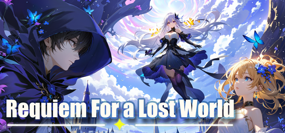
I would like to present you all with a brand new look for the Requiem for a Lost World!
Update from the future
There is an issue with Nishi's weaponKey of Despairand his ultimate visual effects (thank you Unity for breaking the API), I will release a hotfix for it soon.
Hotfix labeled 1.6.0 HF1 is live fixing the issue, enjoy
Anyway, over to past me~
It's been long in the making and I think it was a necessary step to get rid of that just-a-prototype kind of vibe. Aside from UI changes I also managed to squeeze in some new features and we will go on over them in detail~
So, let's start with the whys. So the old UI was something I put together without much thinking, it was needed to test things and that's it. Over time new features came and it didn't age well, some were just slapped on the UI. In the end I wasn't happy with it.
Another point was that I wanted to make the interface accessible, so it works fine with ultra-wide and if you want to operate it with just a keyboard then you should more or less be able to do that.
Additionally new Stable Diffusion XL became much more usable with some decent models and workflows available so it was also about time to fix these god awful mangled excuses for character arts which also took a while and as of this update is not quite done yet but we will talk about it in the next section.
Anyway, enough rambling, lets get into the changelog and UI overview!
Performance
Lets start with the latest news. I upgraded the project to Unity 6 which has some pretty sweet performance improvements, even if it still is an early access release I wanted to get my hands on these new features. I've seen quite a nice bump in mobile performance and hopefully that carries over to low-end PC devices as well. Although migration was a pain in the ass.
UI changes
Lets jump into the main focus of this update which is the new UI both in and out of game so buckle up cuz there is a lot to unpack here.
Starting off we have a new landing page
Main menu
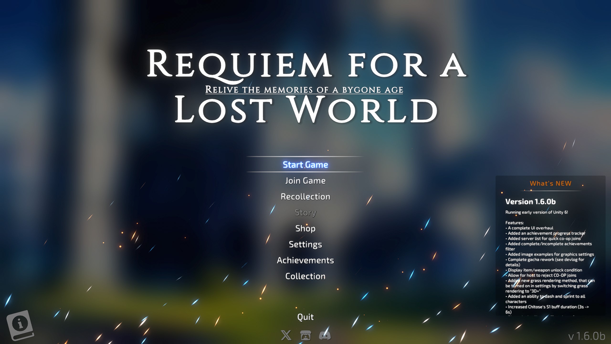
From here you will have access to all of the game's feature, no more cryptic icons on the UI!
You can access tutorials by clicking the info icon in the corner, other than that everything should be clear.
Stage selection
We also got a new stage selection screen buuuuuuuut, we don't have much to chose from just yet :')
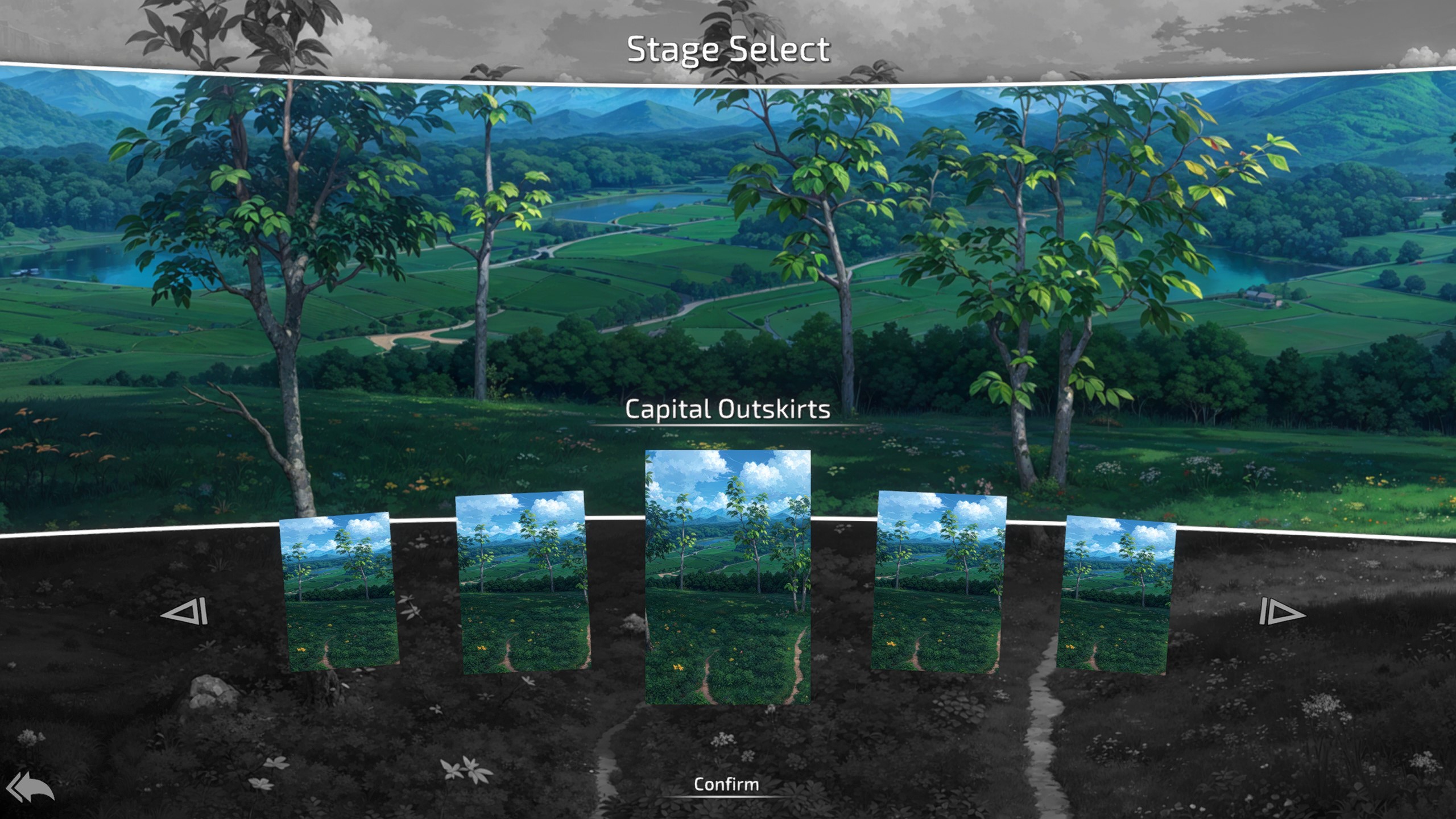
With just one stage it does look a bit weird BUT imma cook up a new stage soon!
Character selection
Arguably the more important part is the new character selection screen:
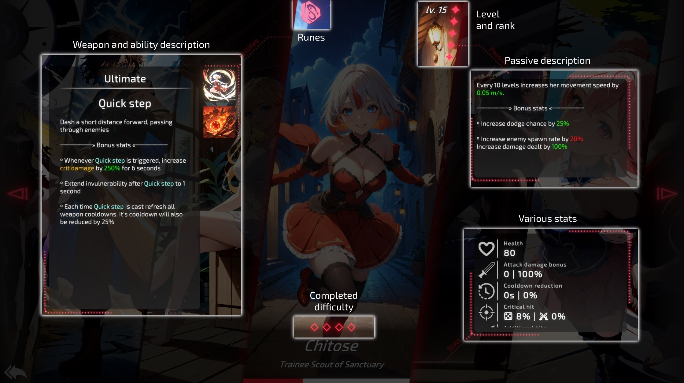
There is some to unpack here:
- Character skill points are now gone and have been replaced with runes - we will talk about these in a dedicated section
- You can see completed difficulty in a similar way you could in a previous UI
- The rank ups are now visible in form of stars on the character card, so you can tell at a glance if you maxed that one out yet!
- Stats have been SIGNIFICANTLY simplified. The idea behind it was that, nobody reads a long ass stat list. ever.
- Weapon/Ultimate descriptions can be toggled by clicking their respective icons
Rank-ups
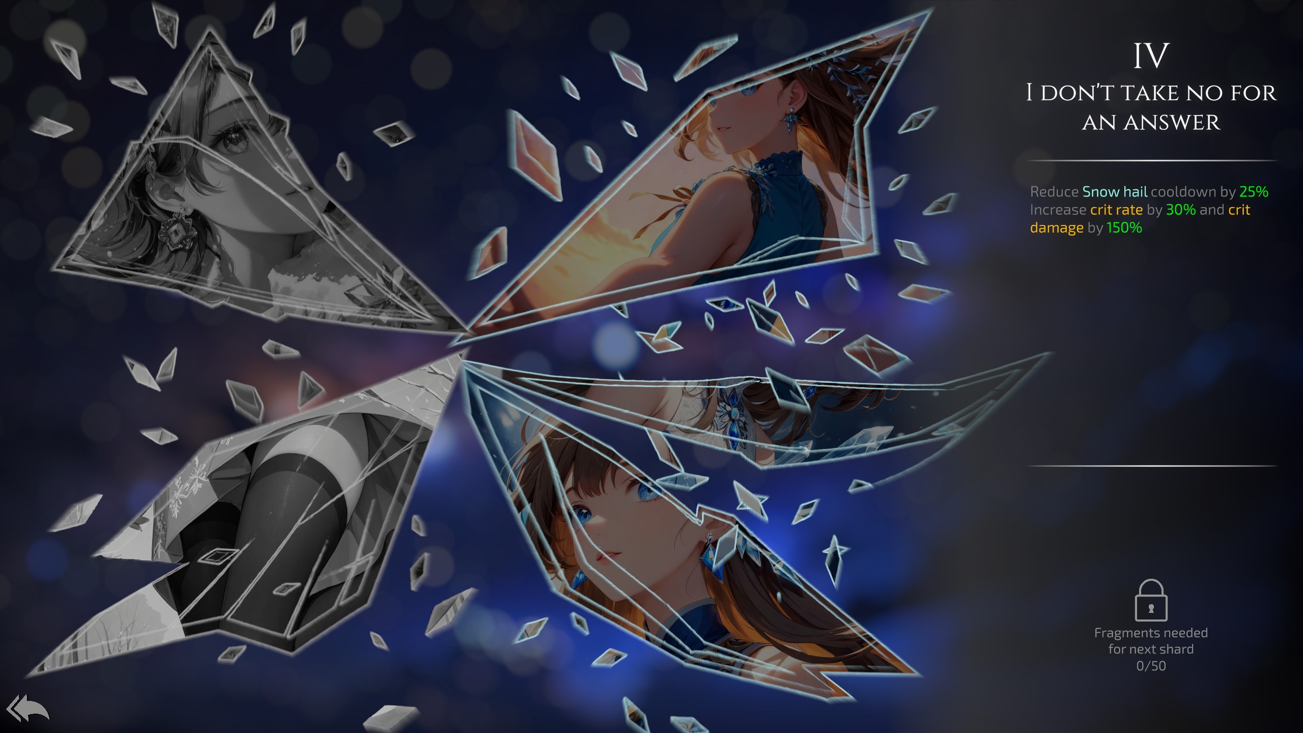
Functionally it's the same, the difference is that you can navigate it with keyboard arrows if you like.
Also shards can be unlocked by gathering enough fragments from gacha, if you are unlucky enough to get them instead.
All shards for every character have gotten a complete graphical remake and look pretty sweet in my option!
Shop
Shop have seen some changes too

Upgrades have been split into more ranks, in exchange price of them have been reduced.
You can also buy gems and the price of them does not change with the amount you bought! Unlimited gold to gem conversion for your gacha needs it is!
Collection
Previously we had some collection screen but it didn't offer much, it's been completely overhauled as well
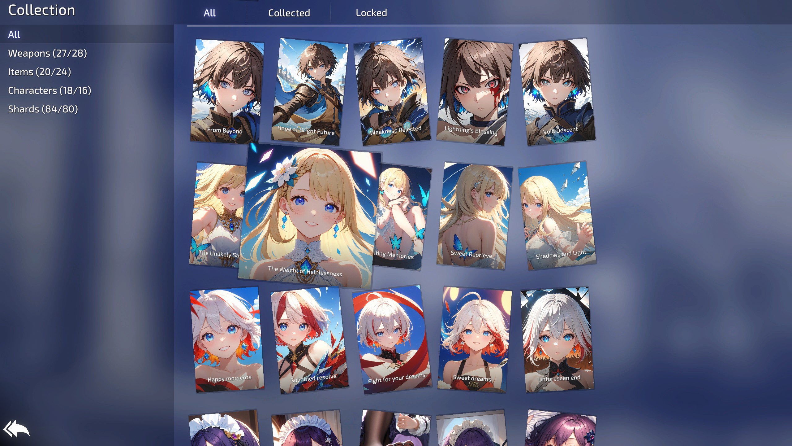
You can now view unlocked items, filter by unlock state and zoom in on the picture if you like by hovering over the image.
When clicked it will display some information about the unlock method and stuff!
Don't mind the over-limit values on the screenshot, I have some stuff unlocked that you cannot have yet :')
Achievements
Achievement screen got a similar overhaul to collections
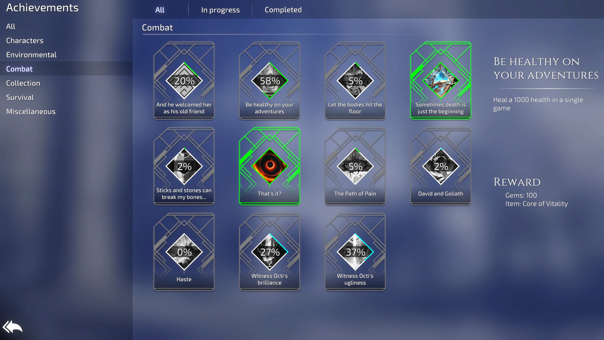
You can view progress of each achievement and it's difficulty (indicated by the color) as well as what each one unlocks.
Similar filtering by state and type is also in place
Settings
Settings have seen some big changes

Each setting got a bit of a disclaimer on what it does alongside with screenshot showcasing the changes made (if applicable)
3 new settings have been introduced
- Max FPS - Allowing you to cap or uncap FPS both if your PC doesn't need to render 150 fps or if your tablet would like to render more than 30 fps
- Upscaling method - this one is big for performance reasons, previously it defaulted to the ugly looking pixelated upscaling whenever render scaling was brought down. You can change the upscaling methods to significantly boost the performance by using lower render scaling without sacrificing visuals by using FidelityFX Super Resolution or the newest STP (that one creates some ghosting but the still image quality is insane even on the lowest render scaling)
- 3D+ Grass - A new type of grass that you will see on some screenshots down below, it has some wind effects, is more performant than the 3D grass but the looks of it might not suit everyone, so it's a stylistic choice.
Recollection
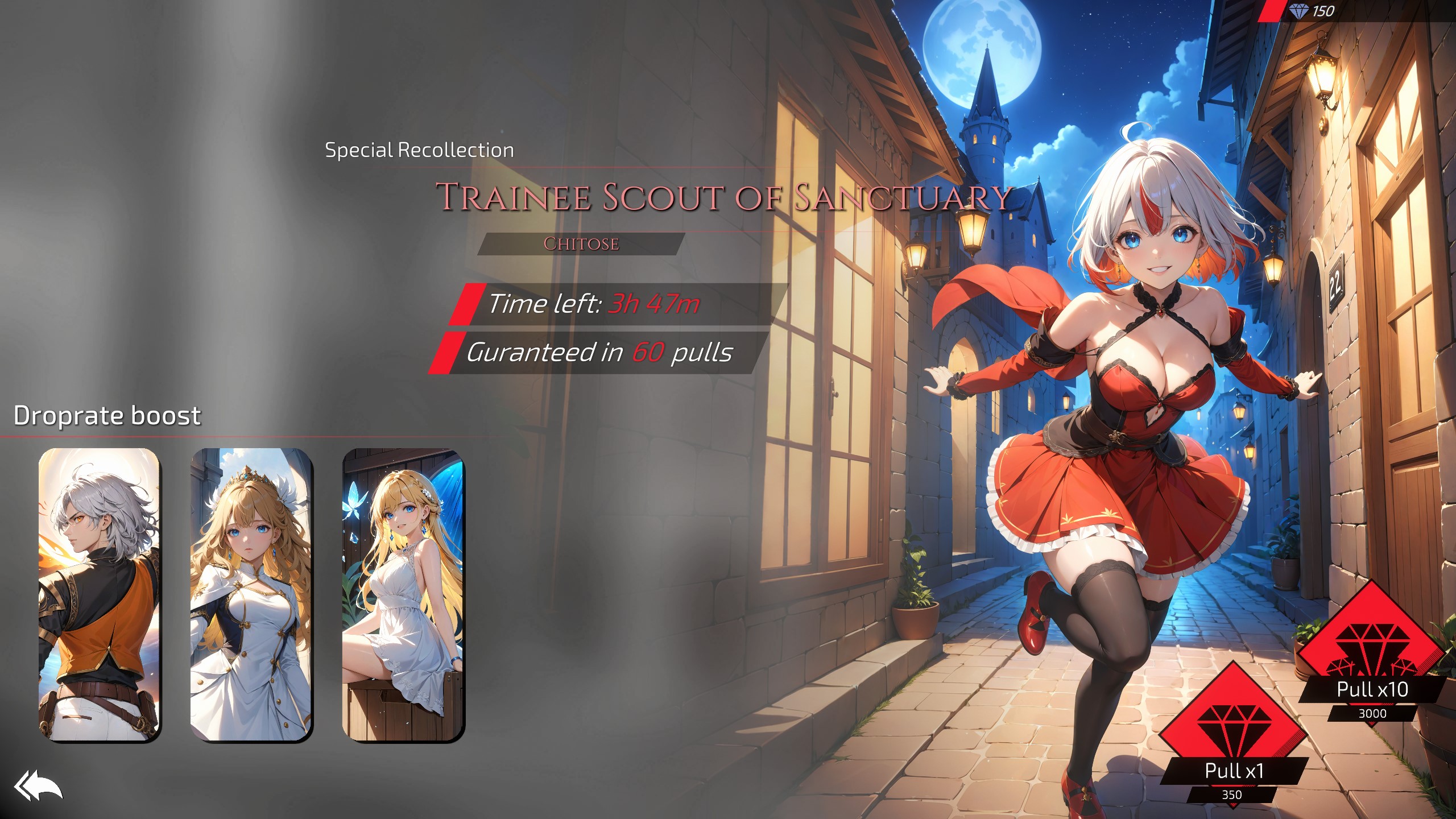
I talked about this one in a separate devlog here but the gist of it is that each day, you will get a new banner that will boost your chances of getting that specific character. You can still obtain other characters from it though but the one on the banner will be guaranteed after a certain amount of pulls.
Aside from characters you can also pull gold, gems and runes
So lets cover a bit of rates that I settled with:
- 10% chance to get promotional character
- 20% chance to get any of the 3 boosted characters and if that fails then any other character excluding the banner character
- 70% chance to get extra rewards:
- 20% chance to obtain random amount of character fragments
- If chosen character is maxed out then you have a 33% chance to gain gold, gems or rune respectively
- 25% chance to obtain 150 gems
- 30% chance to obtain 500 gold
- 25% chance to obtain a random rune
- 20% chance to obtain random amount of character fragments
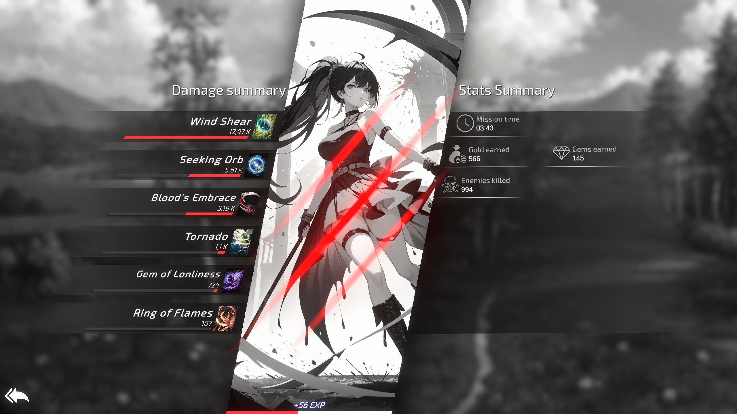
End screen
That one is just a visual improvement but I'm looking forward to expanding it in the future!
Game Settings
Before starting a game you will have a couple options to chose from
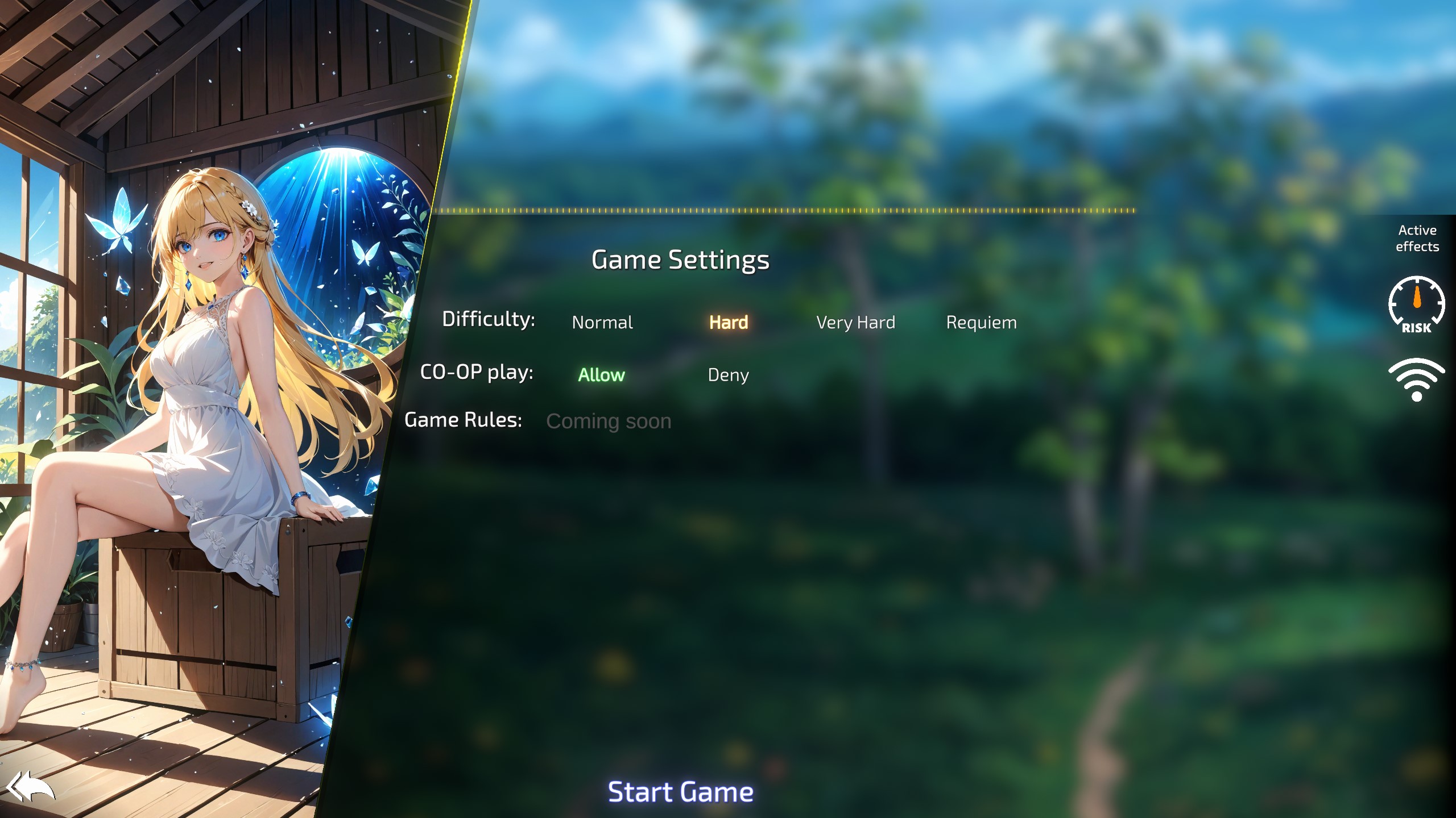
You can change the difficulty (which increases enemy strength but also the rewards) or disable online play if you don't want to be bothered by friends randomly joining your game.
There will also be game rules, most probably in the next version that will allow you to shorten game time, increase or decrease the amount of items you gain and so on, more of a sandbox experience that I didn't yet get to implementing fully and decided to postpone for the next release!
Or if you are the one joining the game, we now have server list

So if you have a friend you game with frequently and you are tired of remembering his IP address, you can just save it here and quickly connect by pressing the connect button! (totally not inspired by Minecraft)
In game GUI
Alright, lets move onto the in game UI!
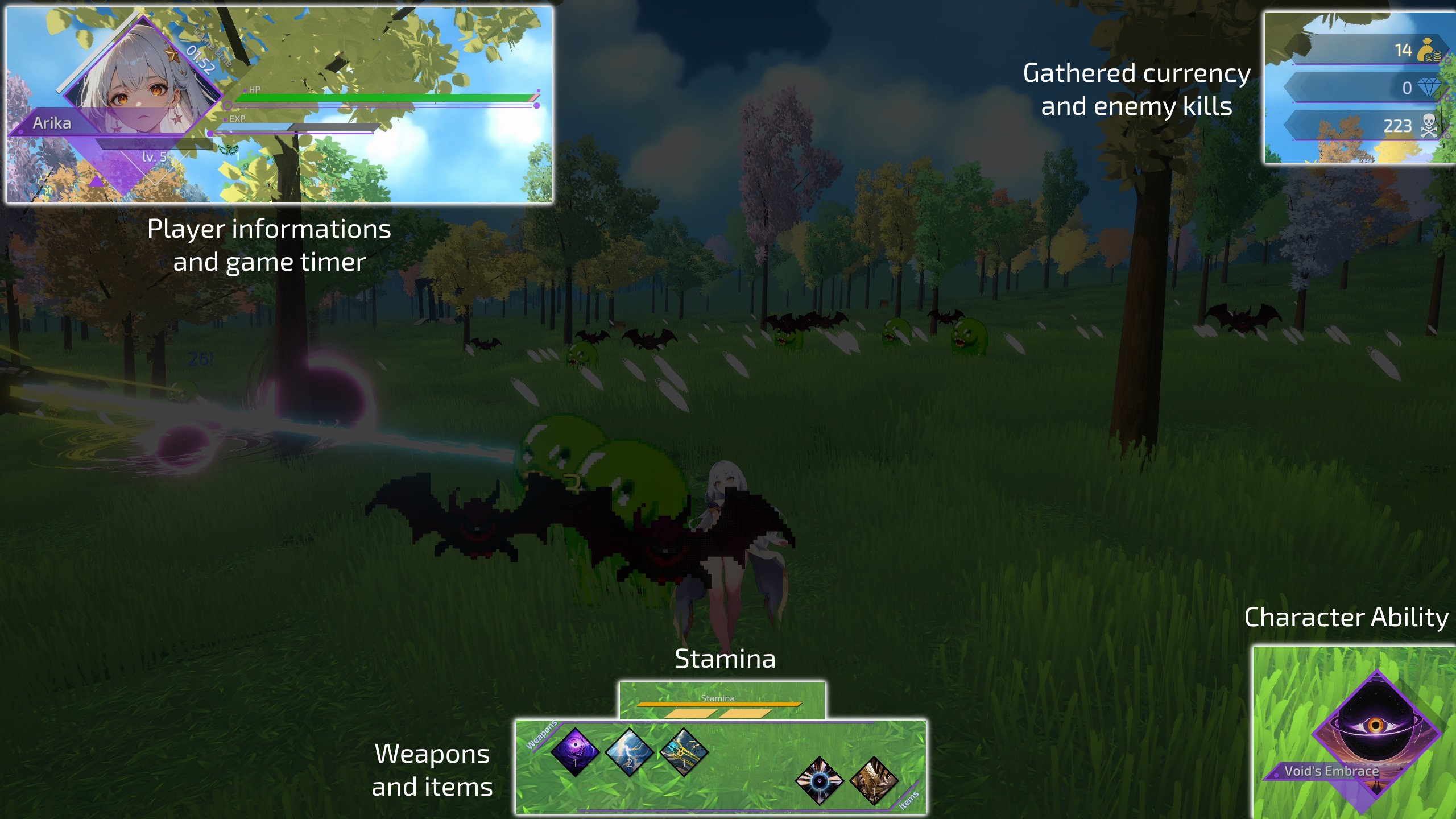
Again, there is some to unpack here. First of all, the timer have been moved closer to the character avatar for compact view.
EXP bar no longer changes color based on character theme, it seemed to cause more troubles than it was worth WhY iS tHe ExP bAr ReD tHoUgHt It iS hEaLtH
But I moved the character theme colors to other UI elements like the avatar, ability and other borders
Ability indicator have been moved to the bottom where the skill button was on mobile devices so now mobile users can tap the image instead of an arbitrary button called Skill
Currently equipped items and weapons are also visible at the bottom of the screen, no need to pause to view what you have!
Speaking of pause.
Pause screen

It's very simple.
Stats got the same treatment as with character selection screen, these only display what I think is the most important to preview. Also the full art of a currently used character is visible here too.
Level ups
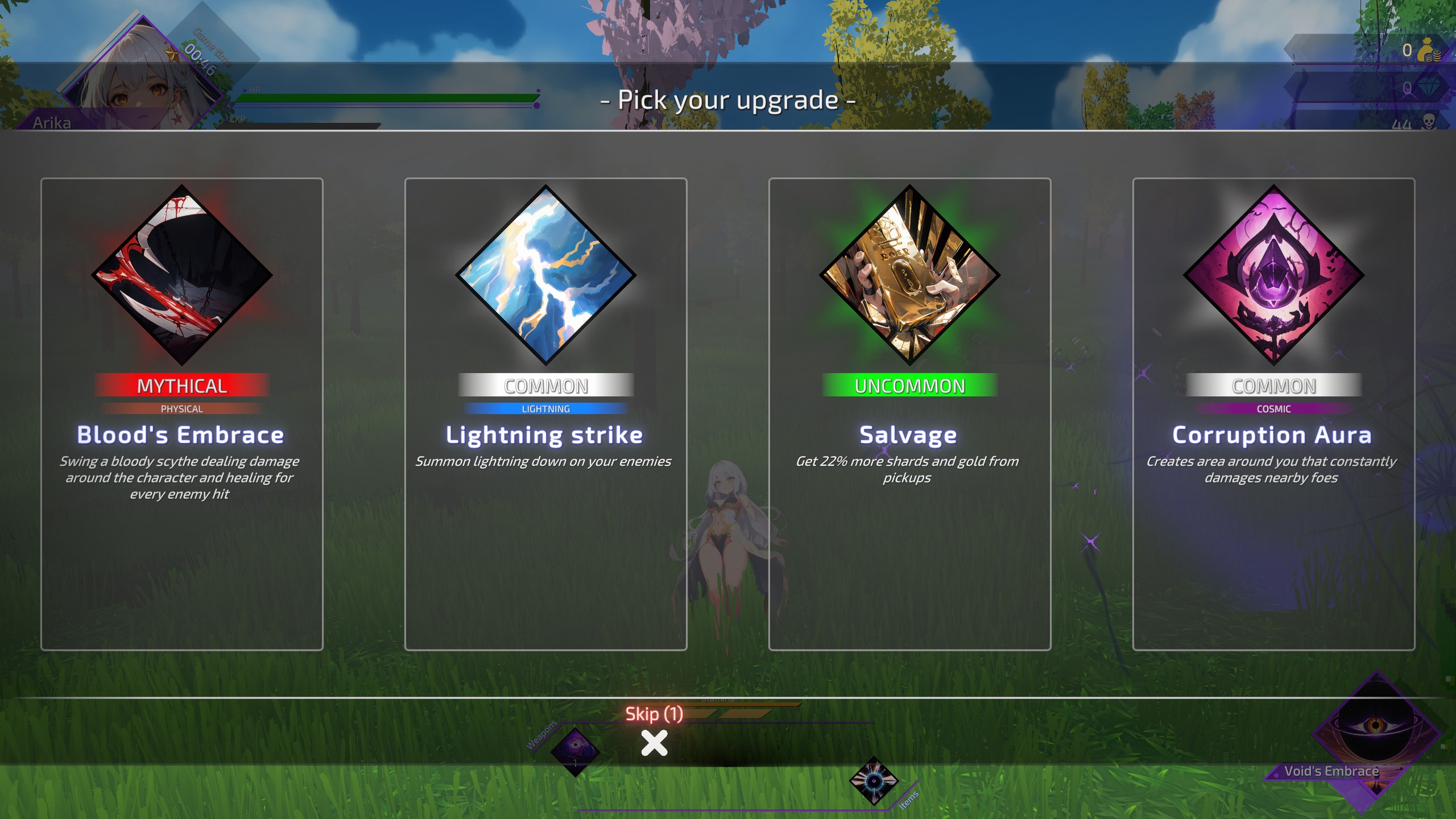
Level up screen also got a bit of an improvement.
Weapon elemental affiliations are now displayed in form of text instead of icons for better clarity. Same with rarity, because even I got confused from time to time.
As a nice quality of life you also cannot accidentally pick an upgrade by pressing space at unfortunate time.
Whenever you pick up a memory rift left by a boss you also get a new screen displaying up to 5 rewards
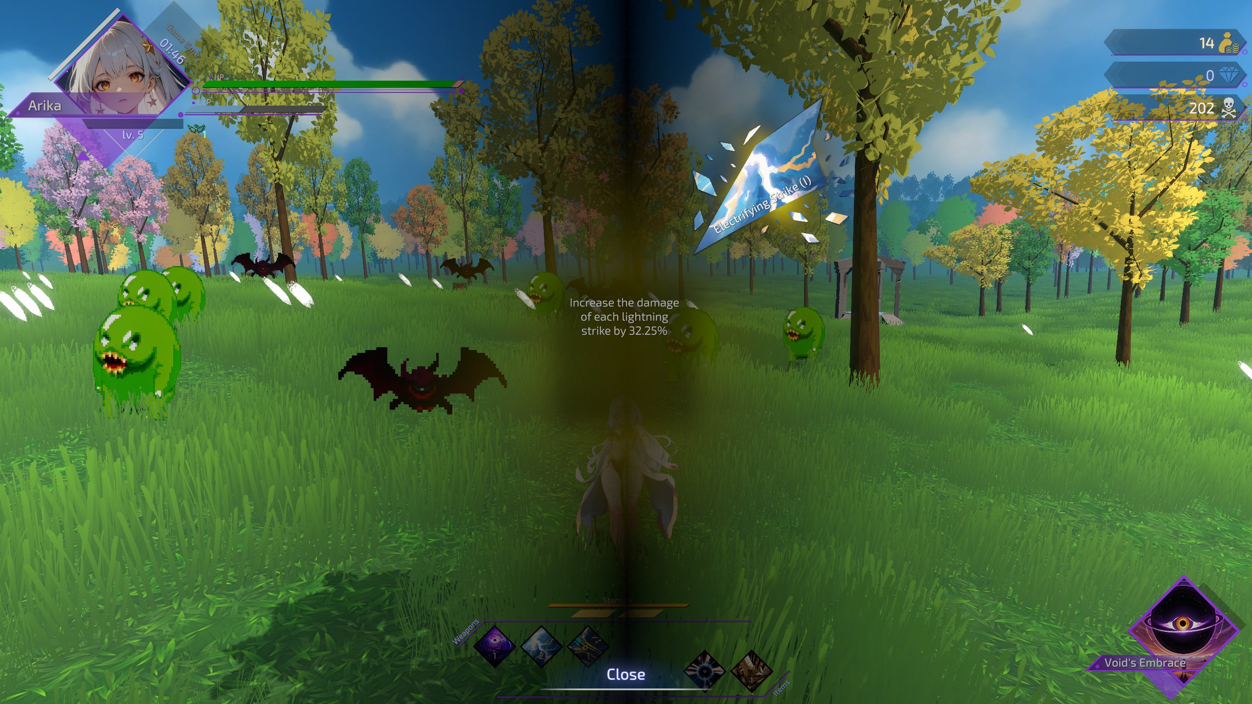
Clicking at each shard displays a short description of that upgrade.
New features
Lets now go over brand new features!
Runes

Runes are a brand new features that's suppose to replace previously introduced perks.
Each character has it's own rune page that can be filled in with runes acquired by pulling the gacha, these also vary in quality and provide a various set of buffs and bonuses.
Runes are split into 3 categories:
- Offensive - increase damage dealt
- Defensive - improves your ability to survive
- Utility - random sets of improvements like exp or gold gain
Each page can hold a limited amount of each type of rune indicated by colored slots. Mixed slots can take in any type of rune and are used when the main path have already been filled.
Players can hold up to 300 runes in inventory but the limit will be increased in future versions!
I came to the conclusion that I quite disliked the perk system, it was pretty passive and the rewards were underwhelming, this should give players more freedom of choice, want to build a DoT David? Go ahead, just get lucky with runes I guess.
Stamina system
So the big thing in this game is that, if you exclude walking there isn't a whole lot left to do. Weapons attack by themselves, enemies close in on you and all you can do it walk out of the way and wiggle around them.
To battle it a little I introduced new movement options for every character: sprinting and dashing
Each character can hold up to 2 dashes (can gain more via newly added items), dashing have iframes so you can dash through enemies without taking damage, each dash has a 20 second cooldown.
Stamina is used for sprinting, each point of stamina allows you to sprint for 1 second (max stamina can also be extended with items) and each character can by default sprint for 2 seconds, stamina regenerates over time for the same duration
Hopefully it will add some more dynamic to the gameplay.
Minor changes
- Ultimate cooldown of a few characters have been reduced to help with what I call "playtime cooldown", essentially I just want you to have one more thing to do a little more often.
- Some shard story fragments have been adjusted - not in a way that alters the story, just wording and expressions, I will continue doing it over the upcoming versions
- Ability icons have been redone for all characters
- Fixed pick up counter for achievements not calculating correctly after picking up an object
- Fixed crate drops that were apparently broken for quite some time and I haven't noticed, oopsie
- Fixed some UI textures scaling when texture quality was set lower than 100% and they looked like a blurry mess
- Improved dithering on enemies that could obfuscate view, it's been implemented previously but I adjusted the distance at which it happens
- Player luck now affects drops from crates
- Increased Chitose's S1 buff duration from 3s to 6s
Coming next
That was probably the most ambitious change I've made to this game so far and to be honest, I think I kind of bit too much than I could chew but hey, it is here now.
1.6.0 is still pretty incomplete in some aspects and I will be working on improving them. For example some arts are still unprocessed, by which I mean they have plenty of AI artifacts going on but ironing them out is such a long process (especially with the amount of arts that I've changed) that I will be slowly rolling out these improvements over time. So please bear with it for the time being, ultimately I still think these are better, at least quality wise, than they have been up until this point.
I promised the story mode be available again in this version but I still have some issues with it and didn't want to stall the release further because of it. But it is almost done and will be released in the upcoming version too.
As always, I'm looking forward to your feedback!
Get Requiem for a Lost World
Requiem for a Lost World
A free 3D vampire survivors-like game in anime style with rich story and a co-op mode!
| Status | In development |
| Author | Nishi |
| Genre | Action |
| Tags | Anime, Casual, Co-op, Fantasy, Multiplayer, Roguelite, Singleplayer, Sprites, Story Rich, Tactical |
| Languages | English |
More posts
- Update 1.7.4-1.8Jan 08, 2025
- Update 1.7.3Nov 25, 2024
- Update 1.7.1Oct 30, 2024
- Available to wishlist now + quick content update!Oct 04, 2024
- Trailer out!Sep 22, 2024
- Update 1.7.0Sep 14, 2024
- Progress report on the next update!Aug 10, 2024
- Fix for co-opJul 07, 2024
- Update 1.6.1bMay 30, 2024
- Update 1.6.0 HF2May 09, 2024
Leave a comment
Log in with itch.io to leave a comment.